Alfred Edward Perlamn, a hot-shot railroad executive from the 1960s, said it well when he stated
“After you’ve done a thing the same way for two years, look it over carefully. After five years, look at it with suspicion. And after ten years, throw it away and start all over.”
And that has never been more true in the world of branding and design as it currently is.
Rebranding is one of the necessary evils of marketing. It’s expensive, it’s risky, and it never feels as urgent as all of the other things you have on your plate – but without it, many companies we know and love would be struggling or even non-existent. Now, rebranding is not changing your company name. It’s not starting from scratch or losing recognition. It is not rewriting your core values or even your colors!
Rebranding is the subtle and ongoing process of evolving the face of your business to appeal to and connect with your ever changing audience.
It is being aware of design trends, looking for ways to improve what you already have, and looking into what message is being sent with your design choices (think of lowercase text as an example).
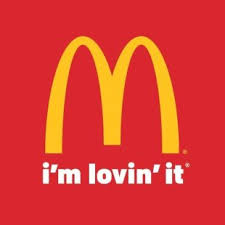
A while back, having your name uncapitalized in a logo would have had a negative connotation. The impression it gave off would have been unprofessional, or possibly uneducated. Fast forward to modern design and lowercase letters are everywhere, invoking feelings of personability and “down-to-earthness”. This was the reason for McDonalds choosing to create their slogan in the lowercase form of “ i’m lovin’ it”.
Amazon is another great example of a company that made this visual jump a few times –

Brands big and small rebrand so often that most of the time we don’t even know it has happened!
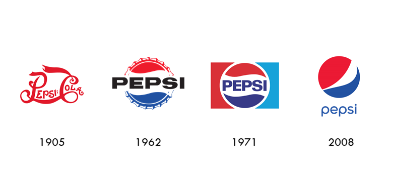
Take a look at Pepsi –
Same name, same colors, same basic shape – but completely different vibes, each one appropriate for the design era it was made in and what the audience found appealing at that time.
Another one of my other favorite evolutions is the beloved starbucks logo.
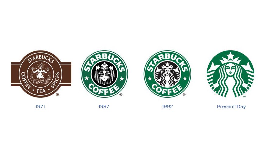
In both Pepsi and Starbucks, you can clearly see their movement toward being cleaner, more modern, more versatile, and simpler. They made these changes because over the past several years that is what has been widely popular.
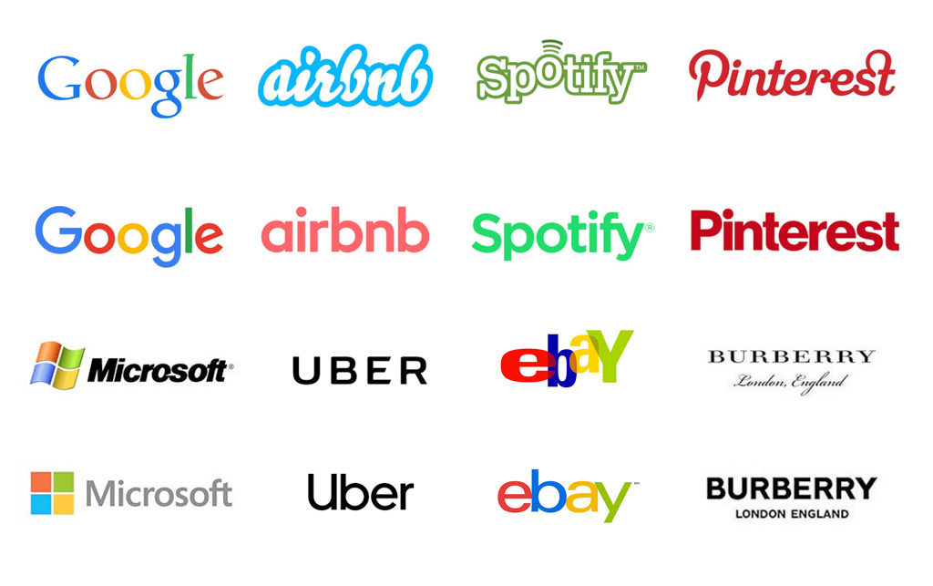
Pepsi and Starbucks were not the only companies who caught on to simple and modern design trends. Around 2018 we saw many companies taking the leap and saw a huge shift from decorative fonts to simple san serif fonts.
We change up our business methods, improve our sales tactics, expand our audiences…so there is no reason our marketing should remain stagnant.
But before you go and rebrand to a clean san serif logo, be warned that this is an ongoing process. Although most big businesses are currently on the clean and modern trend, I predict it will not be this way for long.
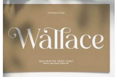
Already there is a resurgence of decorative serif font, reminiscent of the font trends in both the 1920s and 1960s. There is also a continual growth in things looking old school, retro, and in some cases, vintage.


To simplify all of this, the BEST way to rebrand is to know your audience.
Don’t be afraid to spend some time figuring out what they are looking for and investing in a few small changes that will make a huge difference.
0 Comments