
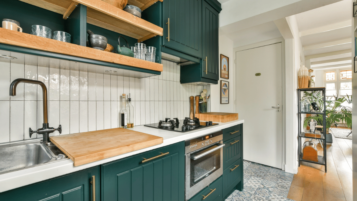
We’re in the middle of shopping for someone to redesign our kitchen.
Our layout is genuinely bad. I know it doesn’t look that way because the kitchen is massive and people always comment on how great it is. But the cupboards are hard to get to, and the 6×10 foot peninsula that sounds impressive? It’s a clutter magnet. Has been for five years. We’ve been ignoring it. And then our appliances started dying one by one, and we figured… okay. Maybe now is the time.
So I did what anyone does. I posted in our local Facebook group and asked for recommendations.
Before I tell you what happened, here’s what I need you to know: I spend most of my days on the other side of this. I’m the one building websites, advising service providers, telling them what their clients need to see. My usual speech goes something like this:
Make it easy for people to contact you.
Add photos of yourself.
Give people the information they’re actually looking for.
Simple stuff. I’ve said it a hundred times.
Okay, back to the kitchen.
I contacted five different designers. And somewhere in the middle of sifting through the flood of recommendations, I caught myself doing exactly what I tell our clients their clients will do.
If there was no About page, it felt too impersonal. Next.
If the contact form was confusing, I didn’t finish it. Next.
If I couldn’t see photos of their work, I wasn’t interested. Next. If I couldn’t even find their website from their Facebook page… Next.
Before you come at me for being harsh, I want you to know I was actually pretty generous about some things….
A few didn’t have their services clearly outlined. Didn’t matter.
If the work looked good, I figured I’d just ask.
Several had websites that were honestly kind of ugly. Also didn’t matter. They’re kitchen designers, not web developers.
And none of them listed pricing, which I know drives some people crazy. It genuinely didn’t bother me.
But the basics? The things I say out loud in almost every client conversation?
My brain filtered people out for exactly those reasons. In real time. Without thinking about it.
What makes a small business website actually work
These aren’t revolutionary. But after spending an afternoon on the customer side of this, I’m more convinced than ever that they matter.
- A contact page that’s impossible to miss. Put a button that links to it everywhere. Your header, your footer, mid-page, all of it. You might think it feels obnoxious. It’s not. When someone is ready to say yes, you want zero friction between that feeling and your inbox.
- A footer with all the important links. Navigation at the top, key links at the bottom. Don’t make people hunt.
- Something about you. For a small service-based business, this is non-negotiable. If I can’t find a face or a name, I start wondering if I’m about to work with a faceless corporation. An About page doesn’t have to be long. It just has to exist.
- A homepage that actually tells me something. Your values, your services, what success looks like when someone works with you. Give me enough to know whether we’re a fit before I fill out a single form.
- Cohesive branding. Our brains are pattern-seeking. A website that looks put-together gives people a sense of order and trust before they’ve read a single word. It’s not about being fancy. It’s about being consistent.
Things that give you a real leg up
- Service pages. Either one comprehensive page that outlines what you offer, or individual pages for each service. Either works. The goal is simple: tell me what you do so I don’t have to guess.
- An explanation of your process. People want to know what they’re signing up for. You don’t have to walk them through every step. But a general sense of what working with you looks like? That goes a long way. It answers a question most people have but won’t ask.
- A lead generator. Not everyone who lands on your site is ready to book a call. Is there something they can sign up for, download, or request that gets them on your email list without committing to anything? If not, you’re leaving a lot of “not yet” people with nowhere to go.
- A portfolio or gallery. Show me the work. Especially if you’re in a service where the output is visual, this is doing more selling than your copy ever will.
- Testimonials or reviews. Two or three quotes from real clients will do more for your credibility than anything you write about yourself. People trust other people. Give them something to point to.
- A mobile-friendly experience. Most people are finding you on their phones. A site that looks polished on a desktop but breaks on mobile is quietly costing you leads. It’s worth checking, because most people won’t tell you it’s broken. They’ll just leave.
- Your location or service area. This one is especially important for local service businesses. If I can’t tell whether you work in my area, I’m not going to reach out to find out. It’s a small thing that’s easy to overlook and costs you more than you’d think, both in lost inquiries and in local search visibility.
Instant turn-offs (at least for me)
- A website that looks like it was built in 2003. I know that sounds harsh. But if you’re not the only option, I’m going to find someone whose site doesn’t make me nervous about what working with them will feel like. A website that’s outdated sends a signal, whether you intend it to or not.
- No contact information. This one genuinely baffles me. If you want people to hire you, make it possible for them to reach you. A missing contact page on a small business website is the fastest way to lose someone who was already interested.
We’re still looking, by the way. The kitchen remains exactly as chaotic as it was when I started this process. The peninsula is still collecting mail.
But I’ll tell you this: when we do find our person, it’ll be because their website made it easy to say yes. Not because they had the fanciest site. Not because they listed every price. Just because the basics were there, and I didn’t have to work to find them.
If you’re a service provider reading this, that’s the whole point.
Your next client is out there right now, doing exactly what I did. Scrolling through recommendations, clicking links, making quick decisions about whether to keep going or move on. You have about thirty seconds to give them a reason to stay.
Make it easy for them