Health Hawk
Branding + Logo Design, Website Design + Development
Problem:
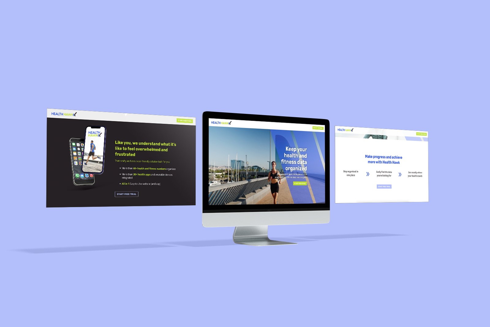
Health Hawk is a new app that organizes health and fitness data for endless users into one place so they see exactly where their health stands. This client was in need of a new logo to ensure uniform marketing graphics across all avenues and a website that would connect with his ideal client. He had a few ideas he wanted to talk through and was unsure what would look best to his target audience. He was specifically interested in using a logo that felt clean, professional, and organized, without being rigid, and that would look great as an app icon.
Solution:
Jamieson dedicated time to prepare before our kick-off call and thoroughly filled out his discovery guide, both of which helped us know exactly how to bring his vision to life. We worked with the Health Hawk team to discuss their vision and desire for their logo while keeping in mind a design that would speak to their ideal customer. In the end, we provided Health Hawk with brand guidelines and a variety of logos to use for different needs. <br />
<br />
Once we had the logo finalized, we could move to designing and developing the website. Jamieson wrote website copy that told a story, inviting his ideal client in and allowing them to see themselves in the problems and solutions. We used his copy to create a website as stunning and cutting-edge as the product it's promoting.
Success:
When we asked Jamieson how he would recognize success on this project, he told us: On a personal level, I’ll know it’s successful when I go, “Yes! That’s it.”<br />
When we finally found the winning logo, he emailed us to say "That's f*cking it!"<br />
<br />
Health Hawk now has brand guidelines and logo variations that are cool, clean, and inviting. With these assets, they can now create digital and print marketing materials that are uniform, with the confidence that their brand represents them well. Their website showcases their product and the problem it solves for customers, all while matching the Health Hawk brand and capturing leads with a free trial offer.
Everything you have done for me so far has been so well organized, well-communicated, and presented perfectly. I have felt comfortable throughout EVERY step of the process and I have always appreciated your kindness and transparency conducted within this journey. When I work with you all I feel like I’m working with friends; I’m BEYOND grateful that I found you, Stratos!