Gargiulo Periodontics
Branding + Logo Design
Problem:
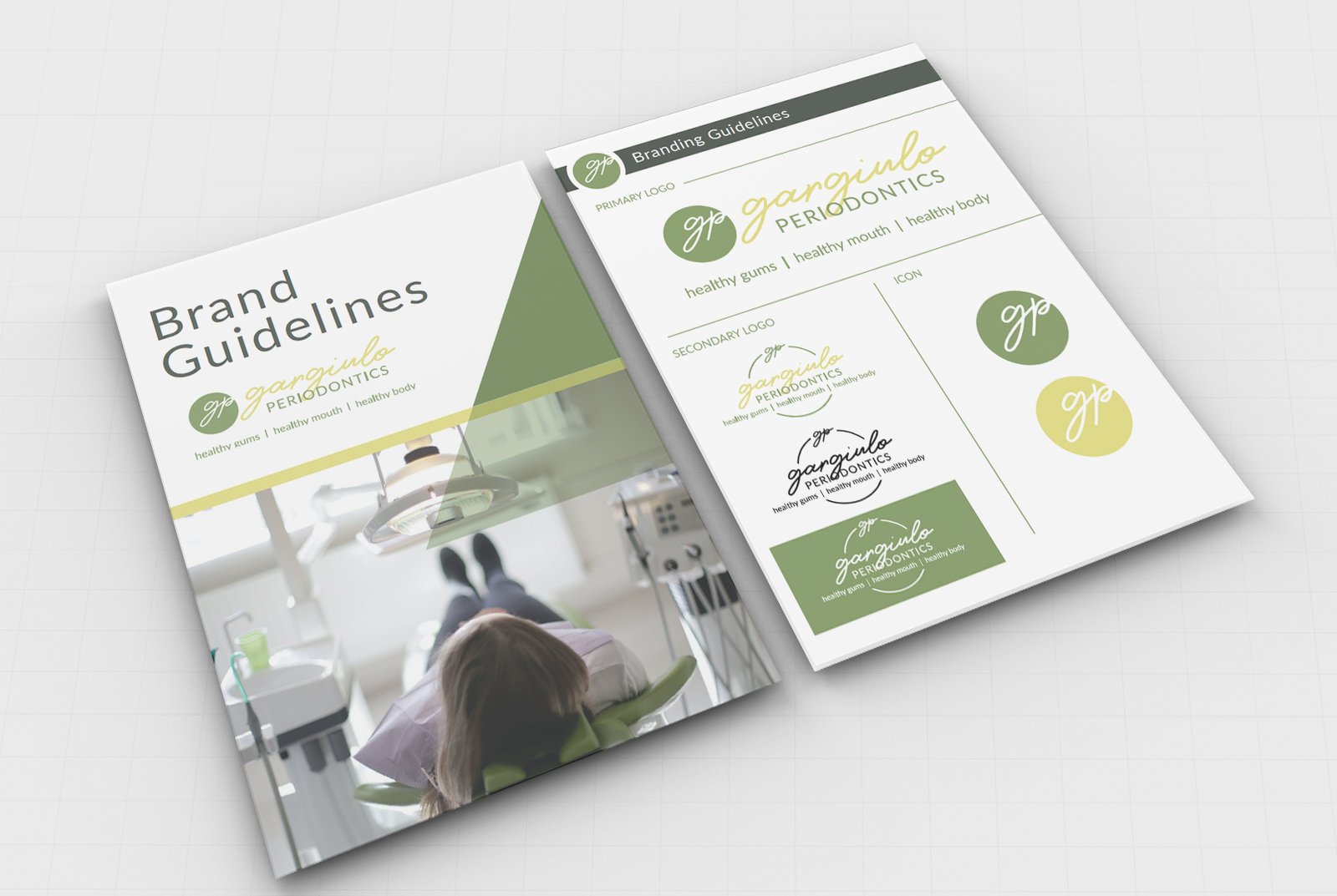
Gargiulo Periodontics has cycled through a number of logos in the past, none of which really stuck with the company. Most dental logos are clinical, sterile, and impersonal; Dr. G and her team are none of those things! They needed a logo and brand guidelines that were as fun, feminine, and friendly as their business. Moving forward, they needed additional branding materials that would capture their personality and draw their ideal customer in for services.
Solution:
We worked with the Gargiulo team to determine what sets them apart as a practice, and how we could incorporate that into their logo and other branding materials. Together we determined that their logo should be professional but friendly, have a feminine feel, and use clean and legible fonts. We were then able to transfer that logo and apply newly defined brand guidelines to other marketing materials like business cards, business envelopes, notepads, referral forms, stickers, and brochures.
Success:
Gargiulo Periodontics now has a logo and brand guidelines that fit their unique persona. Now that they have a new logo and brand guidelines, they also have branded materials that set them apart from the competition and speak to their ideal customers. Now they are also equipped to create future marketing materials and content that accurately represents their personality and draws their ideal customer in.

Our new branding looks fantastic! The logo is so much better than what we had before.
