Genesis Archery
Problem:
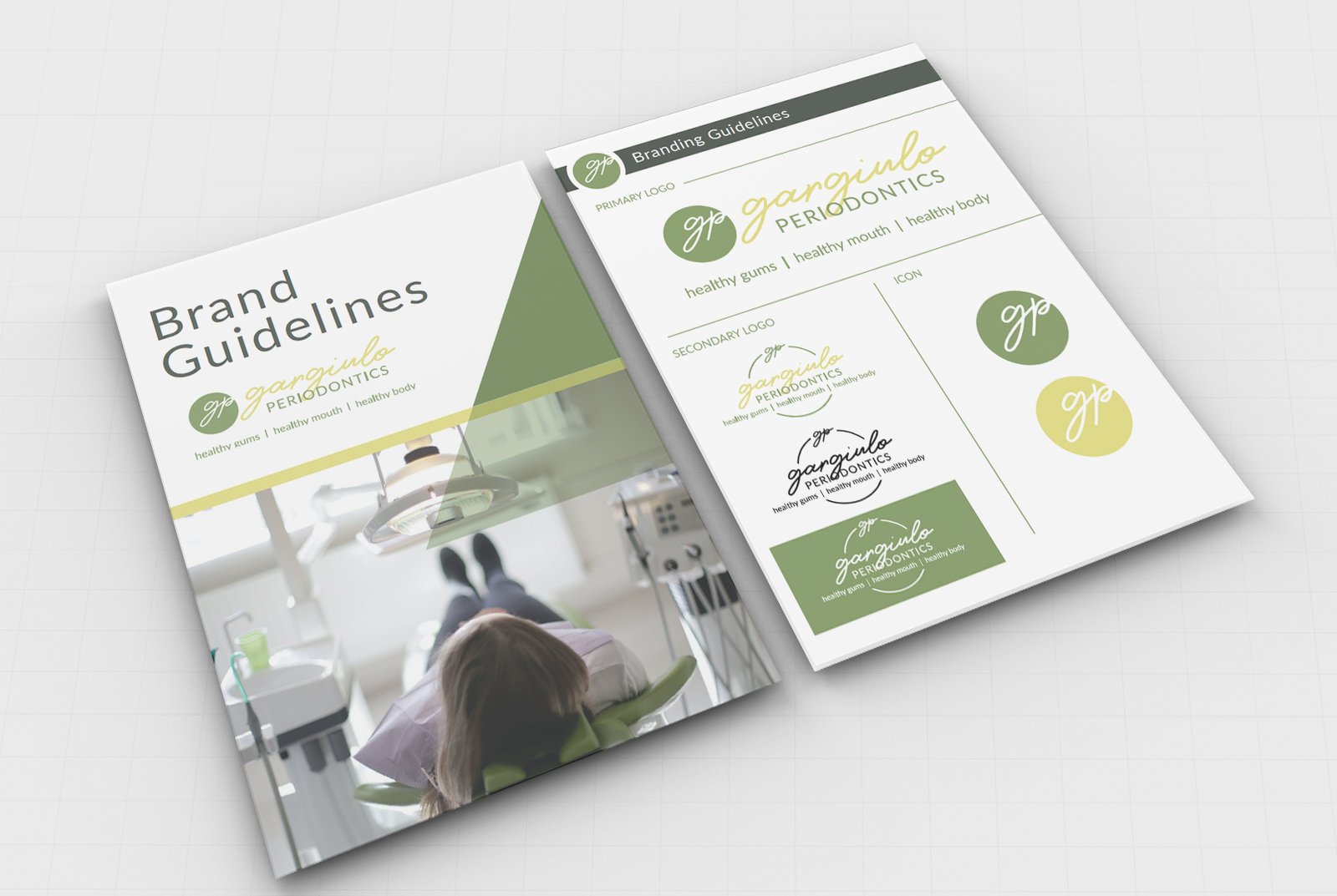
Gargiulo Periodontics has cycled through a number of logos in the past, none of which really stuck with the company. Most dental logos are clinical, sterile, and impersonal; Dr. G and her team are none of those things! They needed a logo and brand guidelines that were as fun, feminine, and friendly as their business. Moving forward, they needed additional branding materials that would capture their personality and draw their ideal customer in for services.
Solution:
The Stratos team sat down with Genesis to define their ideal customer and develop messaging that tells a relatable story for their website, lead generators, social media channels, ads, and weekly newsletters. Once their messaging was established, the Stratos Team began creating content for each of these.
The messages on each of their online spaces speak to their ideal customer of millennial parents. One of the first projects the Stratos team worked on was developing a lead generator for Genesis Archery. This Lead Gen captures potential customers’ email addresses. We continue to provide value to this audience through weekly emails that hit the content buckets Genesis determined to be important and speak to their ideal customer.
In addition to weekly emails, we continue speaking to this ideal customer on social media with messaging that provides value, speaks to their pain point, and calls them to action with Genesis, all while telling a story they can see themself in.
Their social media ads serve as an additional piece of the puzzle, addressing the problem their ideal customer faces and inviting them to download the lead-gen or build a custom bow. Genesis is now able to focus on running their business, while feeling confident that their messaging is building community and nurturing their audience every day.
Success:
Now Genesis Archery’s messaging is consistent across all platforms and speaks directly to their target audience. Since it has been in place, their lead generator has been sent to 4,061 individuals. Their lead generator is performing extremely well, with open rates at 37.1% compared to an industry average of 24.7%, while their click rates for these lead generators are at 13.4%, compared to an industry average of 2.5%.
Aside from the sales funnel emails, this audience opens Genesis newsletter emails at a rate of 24.7% and clicks through them at a rate of 4.9%, both of which are higher than the industry standards of 22.6% and 2.5%.
Since the Stratos Team began creating social media content for Genesis, their Facebook content has received 181.9k engagements, with an engagement rate per post at 12.6%. They have received a total of 7,525 engagements on Instagram, with posts averaging a 60.7% engagement rate.